The year I discovered Sagmeister

Icon

Face

Seen some work by Face in the past. Just really clean beautiful design, in their words ‘intelligence-driven supermodernist design studio’. Based in Monterrey Mexico…A whole host of great work on their site. Pocketmag seen via Design Work Life.

Couple of projects featured: Page magazine + Pocketmag

Advertisement

Filed under: Design, Graphic, , , ,

Joseph Egan & Hunter Thomson

Created by students Joseph Egan + Hunter Thomson for part of their final year show at Chelsea College of Art & Design 2011. All round pretty cool. More pics, vids and words on their site.

Endless links across different networks for this guy but check his Behance page. Originally seen via Jeannie Jeannie.

Filed under: Design, Graphic, , , , , ,

London Design Festival – 2

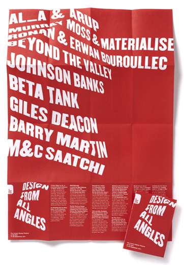
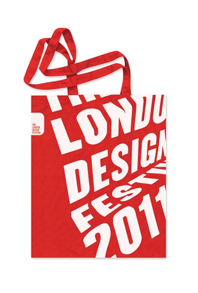
Although the festival is now over for another year, here is some of the promotional collateral that Pentagram designed. 2nd post on the LDF, love this work though. Pics via Pentagram.

Filed under: Design, Graphic, , , ,

London Design Festival promo by Pentagram

From a London Design Festival (LDF) retweet promoting their show I have now found a really great blog from Melanie Kimmett. Double promo here – firstly of the great work by Pentagram  – Dominic Lippa, Jeremy Kunze, Lucy Groom – for the promotional materials and second for LDF retweeting Melanie, who’s site I now will need to pour over for hours!

The theme for this year is the phrase Design from all angles “echoing the desire of the organisers to expand the list of events and disciplines taking part…The team created the look by printing text on pieces of paper and then folding and photographing them from different angles. The differing angles enable the 2011 festival to have a flexible identity across the whole gamut of events whilst maintaining a consistent look and feel. Once more the identity leverages its ownership of red in order to create maximum impact.” Words and pics via Pentagram.

Reminds me of the (hand rendered!) work Alan Fletcher did for Pirelli back in 61 (below) – which is still stunning…

The show itself runs from 17-25 September 2011

Filed under: Design, Exhibition, Graphic, , , , ,

pia jane bijkerk – blog

Fantastic blog of Pia Jane Bijkerk – if you want to see lovely work and photographs. In Pia’s own words she is “an internationally acclaimed stylist, photographer and author specializing in interiors, still life & food. She continues to use her home as her workshop and her travels as inspiration and delights in stepping off the beaten path to discover the unexpected for her clients and readers…and divides her time working and living between Sydney, Parisand a houseboat in Amsterdam.”

To give a flavour of her and her work I have selected at random a post that looks great of window displays + installations that  she worked on. Windows featured are: Better Read Than Dead + Newspaper Taxi (in Brisbane, I think), Shearers (in Leichhardt). (Have taken all the work pics out of context, which I hate to do…but if you want to read more check out the link here).

Like the pics of the work as much as the work itself…Words and images from Pia’s site.

Filed under: Blogs, Design, Photography, , , ,

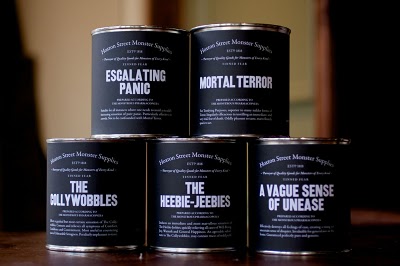
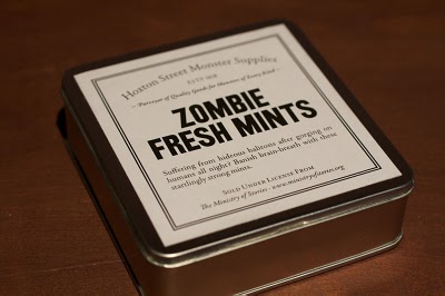
Ministry of Stories – We Made This

Fantastic story behind the fantastic project behind the fantastic concept.

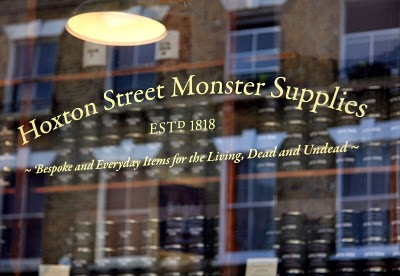
“The Ministry of Stories was founded by Nick Hornby and co-directors Lucy Macnab and Ben Payne. Hidden away at the back of The Monster Shop (where else would you expect it?), the Ministry of Stories provides a free space for fresh writing by young people. Here in Hoxton we provide workshops and one-to-one mentoring. The services are provided by volunteers: local writers, artists and teachers, all giving their time and talent for free.

The MoS is inspired by young people, and aims to inspire them to transform their lives through writing. We work closely with schools, supporting the work of teachers, but our great benefit is that we provide one-to-one mentoring for young people to enjoy imaginative stories, improve language skills, increase abilities in communication, add to social and educational confidence.”

(above words taken from) Ministry of Stories site.
Designed by We Made This (with more pics and explanation) here.

First seen via Graphic Exchange (although not there anymore) + What Makes Us

Filed under: Design, Graphic, Packaging, , , , , ,

Port magazine

Port magazine launching spring – “The new intelligent style magazine for men”

“Editor Dan Crowe and creative directors Kuchar Swara and Matt Willey have created a very modern magazine but one that is clearly positioned within their collective understanding of the history of magazines. This is no surprise – Crowe has form as editor of the creatively successful literary magazine Zembla; Willey designed that title while working at Frost Design; and Swara has worked at Esterson Associates and been part of Tyler Brulé’s Winkreative team, where he helped relaunch Italian interiors title Casa Da Abitare. This is a team with an interest in well-crafted editorial communication.
Seen first via magculture retweeted and blogged the world over I am quite sure.
(Words and images from magculture)

Filed under: Design, Graphic, , , , , , ,

The Lollipop Shoppe – Hamish Makgill

I like the idea of an “identity that didn’t have to only exist in two dimensions” –

“The Lollipop Shoppe is a modern furniture and accessories retailer… We created a bespoke stencil typeface (part inspired by the 20th century modular stencils created by Josef Albers and Le Corbusier, but with a contemporary elegance). This allows the identity to be physical – it can be cut, it can be built, it can be stamped.”
Words and link Branding Served found via the Behance twitter feed


Filed under: Design, Graphic, , , , ,

More from Flickr or FFFound…

Nice posters / design devices used…
I think from Flickr or Found –

Filed under: Design, Graphic, , , ,

Pages

Archives