The year I discovered Sagmeister

Icon

Global Experience Language – BBC

GEL aka Global Experience Language is the title that the Big British Castle use to define their ‘reference point for designing BBC services across Web, Mobile, iPTV and Tablet’. What in previous years would be called ‘online branding’ with an agency knocking together some visuals… this is User Experience driven design.

Awesome.

Advertisement

Filed under: Design, Read, Reference, UX design, , , ,

London Design Festival 2013 – Pentagram

Design is Everywhere was the theme for the LDF this year. Now all packed up for another year – the ident from Pentagram (Dominic Lippa) again is striking and bold. It is nice to see a campaign idea worked across the various applications in a thoughtful way.

Images from Pentagram.

LDF_Invites_01-620x413 LDF_Press-Invite_02-620x412 LDF_VA_09-620x412 BRfM06MCUAABHos.jpg-large

Filed under: Design, Graphic, Identity, , , , , , ,

St Davids vs Cancer Research UK

St Davids by Johnson Banks…

Cancer Research UK by Interbrand…

hmmm….

Filed under: Design, Graphic, Identity, , , , , , ,

Michael Wolff – Intel Visual Life

Saw this via Wolff Olins blog, really simple, and nicely shot film of Michael Wolff talking about ‘his approach to looking at the world, including the muscles of curiosity, appreciation, and imagination.’

Filed under: Design, Film, Podcast / Seminars, Reference, , ,

Umbro HQ – Love

A terribly lazy post, seen via What Makes Us in my usual daily/weekly sweep of favourite blog links…

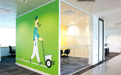
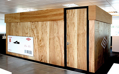
Really lovely work from Love, (based in Manchester) for Umbro HQ, signage + generally making the work place a space to  ‘inspire and motivate’. Images via Love.

A little extra is that Love has a blog as well

Filed under: Blogs, Design, Environmental graphics, Graphic, Interior, Reference, , , ,

VIB event by Soon

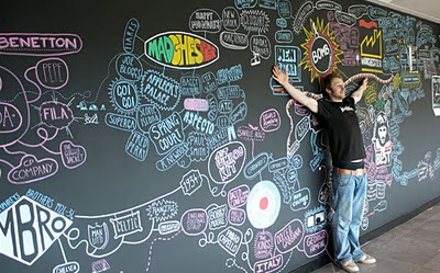
Possibly one of the best things I have seen for a while. Loads of photos on their Behance page, here are a selection…just amazing…

VIB is a life sciences research institute, based in Flanders, Belgium. They perform basic research with a strong focus on translating scientific results into pharmaceutical, agricultural and industrial applications. For their fifteenth anniversary, we did the entire event branding, for which we used only chalk and a huge blackboard. For this event we also designed a box with nine books in it. For the books only we made more then 200 large chalk drawings.

Soon is a Belgian studio that creates visual identities in combination with photography. Most of our work is hand crafted and afterwards transformed into a digital image.”

Vimeo link for Soon

Words and pics by Soon via the Behance network

Filed under: Design, Graphic, Illustration, , , , , ,

London Design Festival – 2

Although the festival is now over for another year, here is some of the promotional collateral that Pentagram designed. 2nd post on the LDF, love this work though. Pics via Pentagram.

Filed under: Design, Graphic, , , ,

Cavalier Essentials – Taylor Pemberton

Seen via the wonderful Graphic Exchange.

Cavalier Essentials is a line of vintage products designed for the rugged, yet sophisticated gentleman. Cavalier was always briefly explained as–“If Steve McQueen carried a beat-up leather duffle bag on the back of his motorcycle; what would be in it and how would the products look?” This simple idea married an appreciation for lifestyle design and vintage accessories. All of the products possess a hand-made quality while responding to the modern influences of today’s culture. Words and pics via Graphic Exchange and Cavalier Essentials.

Designed, directed and produced by Taylor Pemberton – designer from Minneapolis, Minnesota.

Filed under: Design, Graphic, , , ,

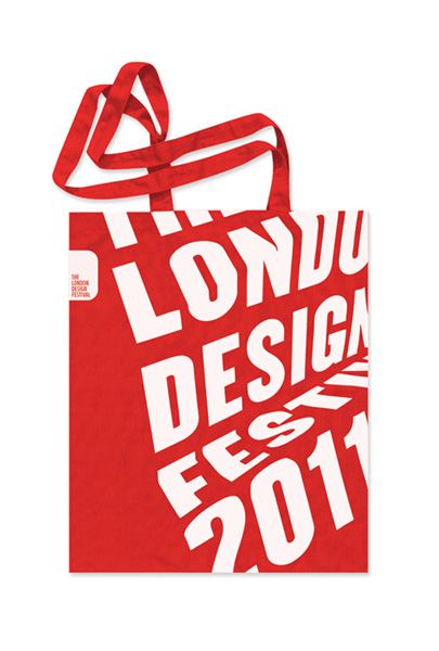
London Design Festival promo by Pentagram

From a London Design Festival (LDF) retweet promoting their show I have now found a really great blog from Melanie Kimmett. Double promo here – firstly of the great work by Pentagram  – Dominic Lippa, Jeremy Kunze, Lucy Groom – for the promotional materials and second for LDF retweeting Melanie, who’s site I now will need to pour over for hours!

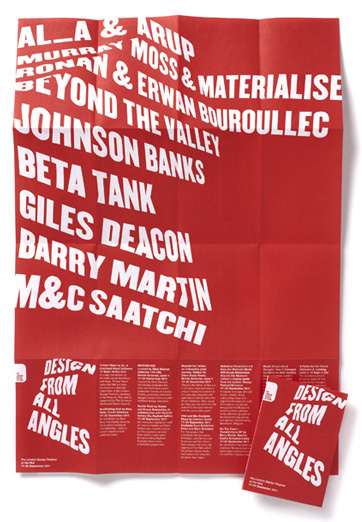
The theme for this year is the phrase Design from all angles “echoing the desire of the organisers to expand the list of events and disciplines taking part…The team created the look by printing text on pieces of paper and then folding and photographing them from different angles. The differing angles enable the 2011 festival to have a flexible identity across the whole gamut of events whilst maintaining a consistent look and feel. Once more the identity leverages its ownership of red in order to create maximum impact.” Words and pics via Pentagram.

Reminds me of the (hand rendered!) work Alan Fletcher did for Pirelli back in 61 (below) – which is still stunning…

The show itself runs from 17-25 September 2011

Filed under: Design, Exhibition, Graphic, , , , ,

Betty & June – Ryan Feerer

Seen via Graphic Exchange – then checked out Ryan Feerer’s site. Really nice stuff, all the way from Abilene, Texas.
Love the work, but also the quality of the photography of the work – the fact that they are great shots and also the graininess of them.
Words and pics from here.

“…branding and packaging for my (Feerer’s) friend’s boutique here in Abilene, Texas. All of the bags, tags, and business cards were hand stamped. Its quite a bit of work but feels more personable this way. Also, its more cost effective in the long run. Its pretty hip for Abilene… which is a wonderful thing!”

Filed under: Design, Graphic, Photography, , , , ,

Pages

Archives