The year I discovered Sagmeister

Icon

Film 4 – ManvsMachine

From what I read on It’s Nice That – these are the new Film 4 idents created by ManvsMachine (this link has loads more words and design) and 4Creative. Also check out their (MvsM) Vimeo channel.

“ManvsMachine set out to create a film channel rather than a tv channel, covering all on-air aspects of the brand from idents to OSP and beyond. A custom motion technique, a contemporary take on a classic film strip / projector effect, was developed to span graphic and live-action elements to give the package a visual signature beyond the logo.”

Looks like a dream project – so much reference and source material to play with – seen together on the following shorts, it looks a really strong creative execution – can’t wait to see it live.

Seen via It’s Nice That. Words ManvsMachine.

Advertisement

Filed under: Design, Film, Identity, , , , , ,

St Davids vs Cancer Research UK

St Davids by Johnson Banks…

Cancer Research UK by Interbrand…

hmmm….

Filed under: Design, Graphic, Identity, , , , , , ,

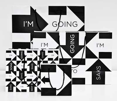
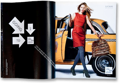
I’m Going to Saks (Fifth Avenue) – Pentagram

Lazy post – seen via What Makes UsPentagram’s work for Saks Fifth Avenue…
Images from What Makes Us…


Filed under: Design, Graphic, , ,

VIB event by Soon

Possibly one of the best things I have seen for a while. Loads of photos on their Behance page, here are a selection…just amazing…

VIB is a life sciences research institute, based in Flanders, Belgium. They perform basic research with a strong focus on translating scientific results into pharmaceutical, agricultural and industrial applications. For their fifteenth anniversary, we did the entire event branding, for which we used only chalk and a huge blackboard. For this event we also designed a box with nine books in it. For the books only we made more then 200 large chalk drawings.

Soon is a Belgian studio that creates visual identities in combination with photography. Most of our work is hand crafted and afterwards transformed into a digital image.”

Vimeo link for Soon

Words and pics by Soon via the Behance network

Filed under: Design, Graphic, Illustration, , , , , ,

Cavalier Essentials – Taylor Pemberton

Seen via the wonderful Graphic Exchange.

Cavalier Essentials is a line of vintage products designed for the rugged, yet sophisticated gentleman. Cavalier was always briefly explained as–“If Steve McQueen carried a beat-up leather duffle bag on the back of his motorcycle; what would be in it and how would the products look?” This simple idea married an appreciation for lifestyle design and vintage accessories. All of the products possess a hand-made quality while responding to the modern influences of today’s culture. Words and pics via Graphic Exchange and Cavalier Essentials.

Designed, directed and produced by Taylor Pemberton – designer from Minneapolis, Minnesota.

Filed under: Design, Graphic, , , ,

Betty & June – Ryan Feerer

Seen via Graphic Exchange – then checked out Ryan Feerer’s site. Really nice stuff, all the way from Abilene, Texas.
Love the work, but also the quality of the photography of the work – the fact that they are great shots and also the graininess of them.
Words and pics from here.

“…branding and packaging for my (Feerer’s) friend’s boutique here in Abilene, Texas. All of the bags, tags, and business cards were hand stamped. Its quite a bit of work but feels more personable this way. Also, its more cost effective in the long run. Its pretty hip for Abilene… which is a wonderful thing!”

Filed under: Design, Graphic, Photography, , , , ,

French & German Film Festival 2010 – The International Office

In New Zealand, the Goethe-Institut, the Alliance Française, the German and the French Embassies have been active for many years fostering cultural cooperation and bringing films over here that otherwise would not have reached their Kiwi audience. Last year, the first German Film Festival in New Zealand commemorated the 20th anniversary of the fall of the Berlin Wall. The French Embassy has for four years in a row organised a similar festival in different cities around the country. Typeface: Haas Grotesk. Stock: Media Satin

From The International Office. Words and pics from their site.

Filed under: Design, Graphic, , , , , , ,

Pino – lifestyle store

“Pino is a market place for unique, functional and innovative design objects. The idea for the concept camefrom the name of the shop, Pino, which means a ‘pile’ or ‘stack’ in Finnish.That is taken visually into the new logo and the design of the shop fixtures.The interior concept with a subtle colour palette works as a background for thefresh, colourful identity and products.”

Words and images via Behance here.
Designed by Bond Creative Agency who hail from Helsinki.

(Photo credit Paavo Lehtonen)

Filed under: Design, Graphic, Interior, , , , , ,

Matjaz Cuk visual identity

Love the simplicity and thought behind this.

“A small design studio needs many different office materials for its communication. In order to cut down on costs, resources and waste, I had to rethink the design of stationery. Plans of 9 different items are printed on one sheet of paperboard using only two printing inks. A paper with excellent environmental credentials from Gmund has been used.

The required item can be cut out on demand. From one sheet of paper you can get:
– two small folders
– one large folder
– 7 CD packages, 5 medium sized cards and one bookmark
– two small notebook covers and 6 small cards
– two large notebook covers

Variable information such as my logo and address are printed on removable stickers. Printing waste is therefore minimal as materials can be used in various ways, reused and recycled at the end of their lifecycle.”

Matjaz Cuk Visual Identity – words and images taken from here.

Seen via Behance twitter feed.

Filed under: Design, Graphic, Printing techniques, , , , ,

Pages

Archives