The year I discovered Sagmeister

Icon

London Design Festival 2013 – Pentagram

Design is Everywhere was the theme for the LDF this year. Now all packed up for another year – the ident from Pentagram (Dominic Lippa) again is striking and bold. It is nice to see a campaign idea worked across the various applications in a thoughtful way.

Images from Pentagram.

LDF_Invites_01-620x413 LDF_Press-Invite_02-620x412 LDF_VA_09-620x412 BRfM06MCUAABHos.jpg-large

Advertisement

Filed under: Design, Graphic, Identity, , , , , , ,

Pentagram

Party banner for 2 new partners (Natasha Jen and Emily Oberman) to Pentagram – designed by Eddie Opara. Super simple, lovely idea.

Filed under: Design, Graphic, , , ,

I’m Going to Saks (Fifth Avenue) – Pentagram

Lazy post – seen via What Makes UsPentagram’s work for Saks Fifth Avenue…
Images from What Makes Us…


Filed under: Design, Graphic, , ,

Cass Art

Quite interested to know more about the story and journey of Cass Art and Angus Hyland’s partnership ‘to shake up the traditional art materials retailer’ that has been grown over the last 10 years. Love the current designs for Cass Art’s own product range of cartridge paper. This range seen via Graphic Exchange, more details via Pentagram (another post worth checking out has the full range of sketchbooks and pads).

Filed under: Design, Graphic, , ,

London Design Festival – 2

Although the festival is now over for another year, here is some of the promotional collateral that Pentagram designed. 2nd post on the LDF, love this work though. Pics via Pentagram.

Filed under: Design, Graphic, , , ,

London Design Festival promo by Pentagram

From a London Design Festival (LDF) retweet promoting their show I have now found a really great blog from Melanie Kimmett. Double promo here – firstly of the great work by Pentagram  – Dominic Lippa, Jeremy Kunze, Lucy Groom – for the promotional materials and second for LDF retweeting Melanie, who’s site I now will need to pour over for hours!

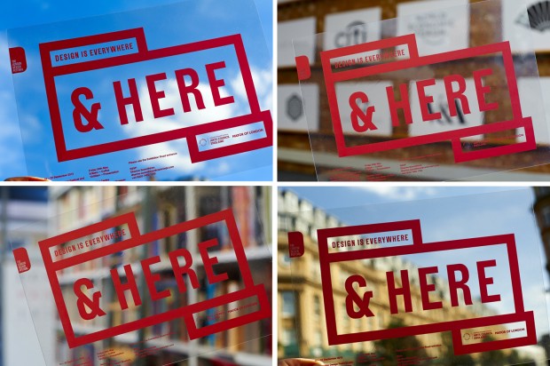
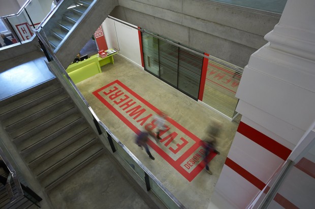
The theme for this year is the phrase Design from all angles “echoing the desire of the organisers to expand the list of events and disciplines taking part…The team created the look by printing text on pieces of paper and then folding and photographing them from different angles. The differing angles enable the 2011 festival to have a flexible identity across the whole gamut of events whilst maintaining a consistent look and feel. Once more the identity leverages its ownership of red in order to create maximum impact.” Words and pics via Pentagram.

Reminds me of the (hand rendered!) work Alan Fletcher did for Pirelli back in 61 (below) – which is still stunning…

The show itself runs from 17-25 September 2011

Filed under: Design, Exhibition, Graphic, , , , ,

Pages

Archives