The year I discovered Sagmeister

Icon

Computer Arts – New Talent issue

Latest Computer Arts ‘New Talent’ issue ‘ – all about those zesty lemons. Aside from the ‘idea’ I quite like the bright, punchy design. Designed by Paddy O’Hara and printed by Celloglas. Great film by Celloglas of how they made this cover.

For further details check out Creative Bloq’s page (can’t quite work out the relationship between Creative Bloq and Computer Arts, anyhow…)

Computer-Arts-Lemons

Advertisement

Filed under: Design, Graphic, Magazine, Printing techniques, Reference, , , , ,

Paperlux, Novum 11/11

Paperlux: Novum 11/11. Know very little about it other than the what is on the credits. All I know is that I want to get my hands on a copy…but it looks like it is only sold in Germany…hmmm….

Anyhow saw this via Graphic Exchange, just mindblowing skills in design, repro and commitment to a great product. The film of ‘the making of’ is lovely and upbeat. Enjoy.

Filed under: Design, Film, Graphic, Printing techniques, , ,

Matjaz Cuk visual identity

Love the simplicity and thought behind this.

“A small design studio needs many different office materials for its communication. In order to cut down on costs, resources and waste, I had to rethink the design of stationery. Plans of 9 different items are printed on one sheet of paperboard using only two printing inks. A paper with excellent environmental credentials from Gmund has been used.

The required item can be cut out on demand. From one sheet of paper you can get:
– two small folders
– one large folder
– 7 CD packages, 5 medium sized cards and one bookmark
– two small notebook covers and 6 small cards
– two large notebook covers

Variable information such as my logo and address are printed on removable stickers. Printing waste is therefore minimal as materials can be used in various ways, reused and recycled at the end of their lifecycle.”

Matjaz Cuk Visual Identity – words and images taken from here.

Seen via Behance twitter feed.

Filed under: Design, Graphic, Printing techniques, , , , ,

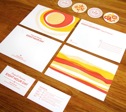
Eight Hour Day + Studio on Fire 

Two of my favourite studios coming together here.
Designed by EHD and printed by SOF – Words EHD.

“We created this identity with the understanding that we would be traveling for a year…Instead of a standard letterhead, we opted for a postcard and notecard. We felt this was more mobile and highlighted the idea that we were on the road. We also use a stamp to pinpoint our location on a map on the mailing label…Our new blog was a large part of this trip…we wanted to have something to give people we met along the way, or those people or places we wanted to feature that wasn’t as stuffy as a business card. Our solution was the blog pog – a bit quirkier leave behind that let people know we were going to blog about them (EHD Likes You) or simply directed people to the blog to find out more (EHD Was Here).”

Eight Hour Day + Studio on Fire both awesome + both in Minneapolis…!

Filed under: Design, Graphic, Printing techniques, , , , , ,

Studio On Fire – designed by Cathy Daly

I haven’t visited Studio On Fire’s site for a while – too much stunning print work on offer to even make an informed choice! Top of their blog seems a great place to start…

“These cards were letterpress printed in three colors on an appropriately sandy colored Mohawk Loop Antique Vellum Husk, custom pasted to a 220lb weight. Note how the island seal is printed in with just tonal transparent white ink. After the letterpress printing, these sheets were pasted back to back with digitally printed sheets (with the island beach image) for a 320lbC final weight. Those sheets were trimmed into oversize 4 x 2 inch business cards and edge colored in a matching blue.”

“This textural business card was designed by island director Cathy Daly for Musha Cay, David Copperfield’s lush 700 acre tropical retreat.”

Studio On Fire – words + work

Filed under: Design, Graphic, Printing techniques, , ,

Pages

Archives