The year I discovered Sagmeister

Icon

Sara Strand

Absolutely love these illustrations – saw this an age ago on Graphic Birdwatching

A personal project to create some fab illustrations for pet food by Sara Strand – a designer and illustrator working in Stockholm, Sweden…  also added to this post are a couple of cute illustrations that she has done as well – there are so many more I could upload…!

sara_strand_petfood_11-425x256

sara_strand_petfood_32

sarastrand_polarbear_530

32995f9f07be909e3176c8859c20a18e

Advertisement

Filed under: Design, Illustration, Packaging, , ,

JAQK by Hatch – 2

GrainEdit interview with Hatch founders (check –1) for full links and context.
Selected words from the interview. Selected images from GrainEdit + Graphic Exchange.

What sort of reference material did you dig up for JAQK ?
Where to start! We have been combing antique stores, finding some incredible vintage gaming ephemera, including hand-painted 17th Century playing cards, old dice games, books on gambling, domino sets, and other incredible treasures. They provide great inspiration and will make nice displays at the JAQK winery someday!

We purchased every book on card collecting, which became inspiration for Soldiers of Fortune. We researched antique derringer decoration, which inspired the Pearl Handle label. The “Her Majesty” queen is our own, but inspired of course, from countless decks of cards we looked at for reference, etc.

We finally landed on the collection of 8 that you see here based on making sure we cover a broad range of style – from more fun, graphic directions like 22 Black and Her Majesty to the more serious labels like Soldiers of Fortune and Black Clover. We also tried to cover different kinds of “play,” – whether craps, poker, cards, luck, etc. so that as we grow, we’re set up to grow in many different directions.

Filed under: Design, Graphic, Packaging, , , , , ,

JAQK by Hatch – 1

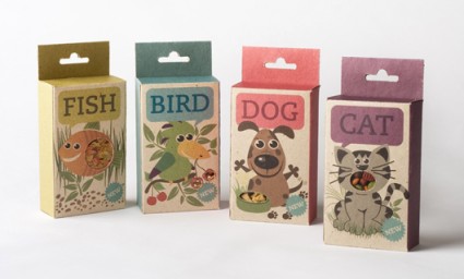
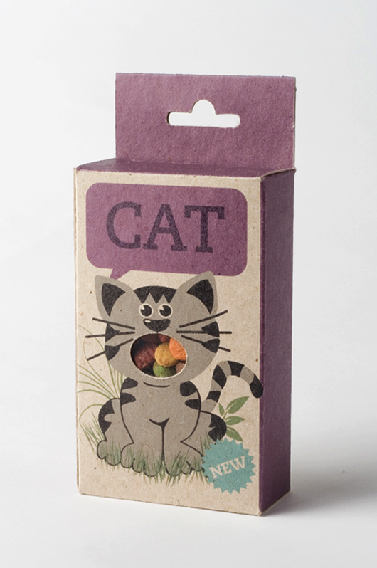
Two reasons to love Hatch are: the quality of work (stunning) and their really exciting + ‘distinctive’ business model. Saw this work for JAQK on Graphic Exchange an age ago but today there is an update and some links to interviews with Hatch founders Joel Templin + Katie Jain with Iso50GrainEdit.

Hatch hail from San Francisco (founded 2007) – (selected) words from an interview with Iso50 back in 2009. Images featured on Iso50 + Graphic Exchange.

“Our original intention, the philosophy of the design firm, was to do this 80/20 split; where 80% of our time is focused on client work, building brands for other people — which we’ve always done and always will do — but then use 20% of the time to give our design team creative freedom to explore ideas for new products that we can hatch on our own. Take all of our creative exploration and put it into a product that we release once a year. Here we are, two an a half years later and JAQK is just growing, which is great, but it will be our only hatchling for a while.”

Their process:
“Internally we meet with the client and develop a creative brief together. We always have that creative brief, either they supply it with their marketing dept, we collaborate on it, or we interview them and we make it. It’s a document that states all the goals for the project and puts everything on paper. It takes the subjectivity out of the design, gets everyone on the same page.

From there we pull reference material. We used to collect old things, old books, scan stuff in, photocopy stuff etc. We used to spend hours at the photocopier. Now, with the web and everything else, everyone has folders full of stuff, so we start there. People pull reference material based on the internal creative brief and where we think it’s going to go. Everyone gets the opportunity to talk about why they pulled what they did, and then collectively we try and figure out ways to put it in silos — like all this stuff feels like an avenue we could go, this type, this color, here’s a illustrative thing we could do etc. Within those, there are still a gazillion things you could design, but at least it’s a little more focused. Then they go to town and start designing and we’ll do the same thing; everything gets pinned up and we talk about it, edit it.”

Online interviews: Part 1 + Part 2

Filed under: Design, Graphic, Illustration, Packaging, , , , , ,

Ministry of Stories – We Made This

Fantastic story behind the fantastic project behind the fantastic concept.

“The Ministry of Stories was founded by Nick Hornby and co-directors Lucy Macnab and Ben Payne. Hidden away at the back of The Monster Shop (where else would you expect it?), the Ministry of Stories provides a free space for fresh writing by young people. Here in Hoxton we provide workshops and one-to-one mentoring. The services are provided by volunteers: local writers, artists and teachers, all giving their time and talent for free.

The MoS is inspired by young people, and aims to inspire them to transform their lives through writing. We work closely with schools, supporting the work of teachers, but our great benefit is that we provide one-to-one mentoring for young people to enjoy imaginative stories, improve language skills, increase abilities in communication, add to social and educational confidence.”

(above words taken from) Ministry of Stories site.
Designed by We Made This (with more pics and explanation) here.

First seen via Graphic Exchange (although not there anymore) + What Makes Us

Filed under: Design, Graphic, Packaging, , , , , ,

Pages

Archives