The year I discovered Sagmeister

Icon

Animal note cards – Melanie Kimmett

Cards by Melanie Kimmett,  (a fab designer from Vancouver with a fab blog).
You can buy them via Etsy‘s shop.

“A happy maker of cute paperie things here in Vancouver, Canada. I’m heavily influenced by clean, modern design and illustration but take many inspired cues from the quirky urban world around me. Every one of my greeting cards are printed on 100% recycled, FSC-certified paper.”

Words from the Etsy site, pics from Melanie Kimmett.

Filed under: Design, Graphic, Illustration, Shop, , , , ,

Poppytalk

A wonderful blog called Poppytalk. Found via the wonderful Melanie Kimmett.

“Poppytalk is a Canadian (Vancouver-based) design blog collecting inspiration and dedicated to promoting emerging design talent” founded and run by husband and wife Jan and Earl.

They also run an “online street market (Poppytalk Handmade) to showcase, buy and sell handmade goods of emerging design talent from around the world.” Words and pic from Poppytalk.

Filed under: Blogs, Design, Graphic, Reference, Shop, , ,

Cavalier Essentials – Taylor Pemberton

Seen via the wonderful Graphic Exchange.

Cavalier Essentials is a line of vintage products designed for the rugged, yet sophisticated gentleman. Cavalier was always briefly explained as–“If Steve McQueen carried a beat-up leather duffle bag on the back of his motorcycle; what would be in it and how would the products look?” This simple idea married an appreciation for lifestyle design and vintage accessories. All of the products possess a hand-made quality while responding to the modern influences of today’s culture. Words and pics via Graphic Exchange and Cavalier Essentials.

Designed, directed and produced by Taylor Pemberton – designer from Minneapolis, Minnesota.

Filed under: Design, Graphic, , , ,

Mélanie Kimmett – 1

A bit of a love in of Melanie Kimmett’s portfolio and blog. I discovered her site yesterday, checked out some of it today and am so impressed with the content of the blog and the fantastic work she does. Melanie is a designer and illustrator based in Vancouver “specialized in conceptualizing identity + brand design, print publication and illustration”. The work that she (and her team) worked on for the Vancouver Olympics is fab – in particular the AMAZING mascots that she was involved with – “from colour/fabric selection, approval of shape and form as well as calculating and producing 3D sewing patterns to ensure the placement of specific characteristics matched the 2D drawings”. I actually wanted these (and still do)!! Words and pics via her site. This will be the first of many posts…!

Links: the Vancouver Olympics 2010 work here.
Blog site here.

Filed under: Blogs, Design, Graphic, , , ,

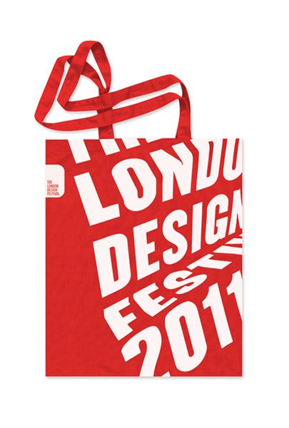
London Design Festival promo by Pentagram

From a London Design Festival (LDF) retweet promoting their show I have now found a really great blog from Melanie Kimmett. Double promo here – firstly of the great work by Pentagram  – Dominic Lippa, Jeremy Kunze, Lucy Groom – for the promotional materials and second for LDF retweeting Melanie, who’s site I now will need to pour over for hours!

The theme for this year is the phrase Design from all angles “echoing the desire of the organisers to expand the list of events and disciplines taking part…The team created the look by printing text on pieces of paper and then folding and photographing them from different angles. The differing angles enable the 2011 festival to have a flexible identity across the whole gamut of events whilst maintaining a consistent look and feel. Once more the identity leverages its ownership of red in order to create maximum impact.” Words and pics via Pentagram.

Reminds me of the (hand rendered!) work Alan Fletcher did for Pirelli back in 61 (below) – which is still stunning…

The show itself runs from 17-25 September 2011

Filed under: Design, Exhibition, Graphic, , , , ,

Show RCA 2011

Show RCA 2011 starts from 24 June – 3 July 2011.
(11am – 8pm daily) Check here for all the visitor info.
Note to self – go this year, its been a while…

“At Show Battersea, Fine Art students exhibit in the Painting and Sculpture buildings at the RCA’s SW11 campus and in the Testbed 1 Gallery nearby. Applied Art, Architecture, Communications, Design, Fashion & Textiles and Humanities come together at Show Kensington in a remarkable gathering of design talent. Show Fashion – when graduates present their final collections in two catwalks shows – took place on 1 June, to great acclaim.” Words from the RCA site, image from their twitter feed.

Filed under: Design, Exhibition, Graphic, , , ,

Geekhearts a day – Rebekah Lock

Awesome daily online sketch book by my mate Becky. She has set herself the challenge of creating a heart shaped ‘design’ every day for 2011. Each heart that is created has a lovely story with it. Check it out here.

Filed under: Blogs, Graphic, , , ,

Carlton Brewery by Cornwell


Cornwell
 – seen some other work by these guys on 1983, checked out their site and really like the look of this work they did for Carlton Brewery. Words and pic from their site.

“The Carlton Brewery is one of Melbourne’s largest urban renewal projects. It features commercial, residential and retail environments. As Grocon’s brand and communication advisor, we set up the nomenclature and a brand identity system to support all phases of the project. Our New City Living campaign came out of the project’s Pixel building, the first totally carbon neutral building of its type in Australia.”

Filed under: Design, Graphic, , , , ,

Betty & June – Ryan Feerer

Seen via Graphic Exchange – then checked out Ryan Feerer’s site. Really nice stuff, all the way from Abilene, Texas.
Love the work, but also the quality of the photography of the work – the fact that they are great shots and also the graininess of them.
Words and pics from here.

“…branding and packaging for my (Feerer’s) friend’s boutique here in Abilene, Texas. All of the bags, tags, and business cards were hand stamped. Its quite a bit of work but feels more personable this way. Also, its more cost effective in the long run. Its pretty hip for Abilene… which is a wonderful thing!”

Filed under: Design, Graphic, Photography, , , , ,

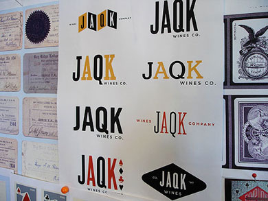
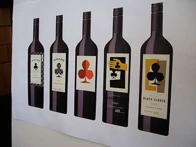
JAQK by Hatch – 2

GrainEdit interview with Hatch founders (check –1) for full links and context.
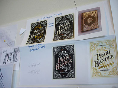
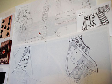
Selected words from the interview. Selected images from GrainEdit + Graphic Exchange.

What sort of reference material did you dig up for JAQK ?
Where to start! We have been combing antique stores, finding some incredible vintage gaming ephemera, including hand-painted 17th Century playing cards, old dice games, books on gambling, domino sets, and other incredible treasures. They provide great inspiration and will make nice displays at the JAQK winery someday!

We purchased every book on card collecting, which became inspiration for Soldiers of Fortune. We researched antique derringer decoration, which inspired the Pearl Handle label. The “Her Majesty” queen is our own, but inspired of course, from countless decks of cards we looked at for reference, etc.

We finally landed on the collection of 8 that you see here based on making sure we cover a broad range of style – from more fun, graphic directions like 22 Black and Her Majesty to the more serious labels like Soldiers of Fortune and Black Clover. We also tried to cover different kinds of “play,” – whether craps, poker, cards, luck, etc. so that as we grow, we’re set up to grow in many different directions.

Filed under: Design, Graphic, Packaging, , , , , ,

Pages

Archives