The year I discovered Sagmeister

Icon

This Crooked Way by The International Office

New Zealand’s moody, antipodean atmosphere evoked by clothing through monochromatic colour palettes and textural layering captured through beautiful photography from Meighan and David. Photography: Meighan Ellis & David James. Typefaces: Franklin Gothic, Brunel. Stock: 150gsm Photo-grade.

Seen via 1983
Designed by The International Office – not 100% sure of where they are based but I think this work looks awesome. Words + pics from The International Office.

Filed under: Design, Graphic, Photography, , , , , , ,

Matjaz Cuk visual identity

Love the simplicity and thought behind this.

“A small design studio needs many different office materials for its communication. In order to cut down on costs, resources and waste, I had to rethink the design of stationery. Plans of 9 different items are printed on one sheet of paperboard using only two printing inks. A paper with excellent environmental credentials from Gmund has been used.

The required item can be cut out on demand. From one sheet of paper you can get:
– two small folders
– one large folder
– 7 CD packages, 5 medium sized cards and one bookmark
– two small notebook covers and 6 small cards
– two large notebook covers

Variable information such as my logo and address are printed on removable stickers. Printing waste is therefore minimal as materials can be used in various ways, reused and recycled at the end of their lifecycle.”

Matjaz Cuk Visual Identity – words and images taken from here.

Seen via Behance twitter feed.

Filed under: Design, Graphic, Printing techniques, , , , ,

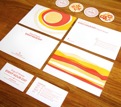
Eight Hour Day + Studio on Fire 

Two of my favourite studios coming together here.
Designed by EHD and printed by SOF – Words EHD.

“We created this identity with the understanding that we would be traveling for a year…Instead of a standard letterhead, we opted for a postcard and notecard. We felt this was more mobile and highlighted the idea that we were on the road. We also use a stamp to pinpoint our location on a map on the mailing label…Our new blog was a large part of this trip…we wanted to have something to give people we met along the way, or those people or places we wanted to feature that wasn’t as stuffy as a business card. Our solution was the blog pog – a bit quirkier leave behind that let people know we were going to blog about them (EHD Likes You) or simply directed people to the blog to find out more (EHD Was Here).”

Eight Hour Day + Studio on Fire both awesome + both in Minneapolis…!

Filed under: Design, Graphic, Printing techniques, , , , , ,

Studio On Fire – designed by Cathy Daly

I haven’t visited Studio On Fire’s site for a while – too much stunning print work on offer to even make an informed choice! Top of their blog seems a great place to start…

“These cards were letterpress printed in three colors on an appropriately sandy colored Mohawk Loop Antique Vellum Husk, custom pasted to a 220lb weight. Note how the island seal is printed in with just tonal transparent white ink. After the letterpress printing, these sheets were pasted back to back with digitally printed sheets (with the island beach image) for a 320lbC final weight. Those sheets were trimmed into oversize 4 x 2 inch business cards and edge colored in a matching blue.”

“This textural business card was designed by island director Cathy Daly for Musha Cay, David Copperfield’s lush 700 acre tropical retreat.”

Studio On Fire – words + work

Filed under: Design, Graphic, Printing techniques, , ,

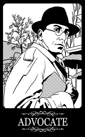
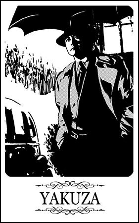
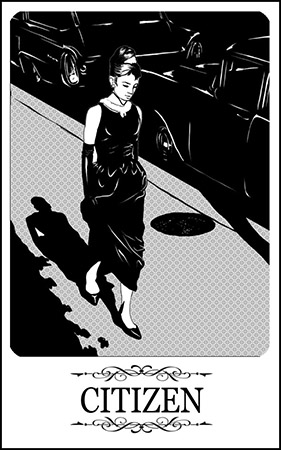
Elena Galitsky – Chicago Mafia playing cards

Link via the Behance twitter feed.
Elena Galitsky

Filed under: Design, Illustration, , , ,

Port magazine

Port magazine launching spring – “The new intelligent style magazine for men”

“Editor Dan Crowe and creative directors Kuchar Swara and Matt Willey have created a very modern magazine but one that is clearly positioned within their collective understanding of the history of magazines. This is no surprise – Crowe has form as editor of the creatively successful literary magazine Zembla; Willey designed that title while working at Frost Design; and Swara has worked at Esterson Associates and been part of Tyler Brulé’s Winkreative team, where he helped relaunch Italian interiors title Casa Da Abitare. This is a team with an interest in well-crafted editorial communication.

Seen first via magculture retweeted and blogged the world over I am quite sure.
(Words and images from magculture)

Filed under: Design, Graphic, , , , , , ,

Nicholas Feltron

I have just put an order in for the latest Feltron report!
Been aware of his work for a few years – amazing, interesting + awesome.

Filed under: Design, Graphic, Infographics, , , ,

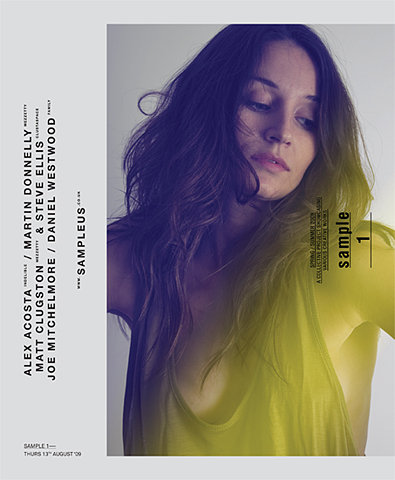
Sample 1

“Sample is an annual exhibition which will showcase the best work from a selection of Midland based creatives.”

Sample 1 – 16pp magazine from 2009
Sample

Filed under: Design, Graphic, , ,

Taxi magazine

No idea where I found this – hmmm

Filed under: Design, Graphic, ,

Derek Richards (pantone calendar)

Derek Richards was commissioned to create a calendar for Pantone.

‘the main aim for me was to make this calendar relevant on a global scale. with the colour wheel being universally recognised, i used this and combined it with a mosaic made up of 1440 different images to create my main graphic. to answer a question i have been asked a few times, no ‘special software’ was used to produce this. the grid was build in Illustrator and i placed all 1440 images by hand in (as close to as possible) some sort of colour order.’

From the Behance Network
Seen via What Makes Us again! Definitely the blog to follow – stunning selection of inspiration.

Filed under: Design, Graphic, , , , ,

Pages

Archives