The year I discovered Sagmeister

Icon

French & German Film Festival 2010 – The International Office

In New Zealand, the Goethe-Institut, the Alliance Française, the German and the French Embassies have been active for many years fostering cultural cooperation and bringing films over here that otherwise would not have reached their Kiwi audience. Last year, the first German Film Festival in New Zealand commemorated the 20th anniversary of the fall of the Berlin Wall. The French Embassy has for four years in a row organised a similar festival in different cities around the country. Typeface: Haas Grotesk. Stock: Media Satin

From The International Office. Words and pics from their site.

Filed under: Design, Graphic, , , , , , ,

German Film Festival 2011 by The International Office

“Madman, adventurer and obsessive, Werner Herzog, with his eye for interesting people is one of the most significant personalities of New German Cinema. Typeface: Helvetica Neue. Stock: 100gsm Media Coated”

More work from The International Office coming out of New Zealand (2nd post of the night) one more to come. Words and pics from their site.

Filed under: Design, Graphic, , , , ,

This Crooked Way by The International Office

New Zealand’s moody, antipodean atmosphere evoked by clothing through monochromatic colour palettes and textural layering captured through beautiful photography from Meighan and David. Photography: Meighan Ellis & David James. Typefaces: Franklin Gothic, Brunel. Stock: 150gsm Photo-grade.

Seen via 1983
Designed by The International Office – not 100% sure of where they are based but I think this work looks awesome. Words + pics from The International Office.

Filed under: Design, Graphic, Photography, , , , , , ,

Pino – lifestyle store

“Pino is a market place for unique, functional and innovative design objects. The idea for the concept camefrom the name of the shop, Pino, which means a ‘pile’ or ‘stack’ in Finnish.That is taken visually into the new logo and the design of the shop fixtures.The interior concept with a subtle colour palette works as a background for thefresh, colourful identity and products.”

Words and images via Behance here.
Designed by Bond Creative Agency who hail from Helsinki.

(Photo credit Paavo Lehtonen)

Filed under: Design, Graphic, Interior, , , , , ,

Truth Branding by Socio

Branding lexicon in the next para – something I absolutely hate – but maybe this is the best way to communicate this stuff???

“Truth is a strategic insight consultancy offering global marketing solutions. They approached Socio to evolve their current branding and to create a fresh and coherent visual template for the brand. The identity needed to offer much more to accurately portray the dynamism and ground breaking approach of the company. The starting challenge was to use the existing logo and company colours but develop all other brand elements. The result was a new cohesive brand direction that was rolled out across internal and external marketing communications, acting as a visual voice for company. Clear guidelines were designed and printed to act as a staff handbook aiding a smooth transition to the new branding, including colour breakdowns, associated fonts as well as photographic style and illustration.”

Words and images taken from here (Behance).
Agency site Socio here.

Filed under: Design, Graphic, , , ,

Matjaz Cuk visual identity

Love the simplicity and thought behind this.

“A small design studio needs many different office materials for its communication. In order to cut down on costs, resources and waste, I had to rethink the design of stationery. Plans of 9 different items are printed on one sheet of paperboard using only two printing inks. A paper with excellent environmental credentials from Gmund has been used.

The required item can be cut out on demand. From one sheet of paper you can get:
– two small folders
– one large folder
– 7 CD packages, 5 medium sized cards and one bookmark
– two small notebook covers and 6 small cards
– two large notebook covers

Variable information such as my logo and address are printed on removable stickers. Printing waste is therefore minimal as materials can be used in various ways, reused and recycled at the end of their lifecycle.”

Matjaz Cuk Visual Identity – words and images taken from here.

Seen via Behance twitter feed.

Filed under: Design, Graphic, Printing techniques, , , , ,

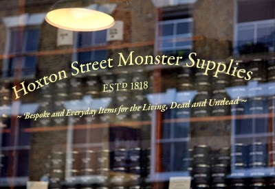
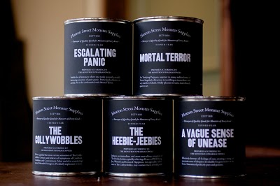
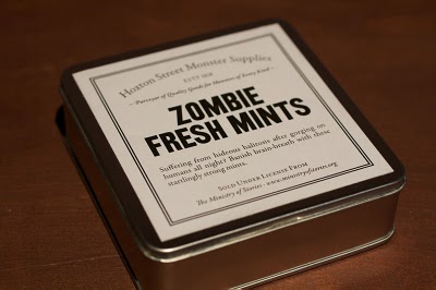
Ministry of Stories – We Made This

Fantastic story behind the fantastic project behind the fantastic concept.

“The Ministry of Stories was founded by Nick Hornby and co-directors Lucy Macnab and Ben Payne. Hidden away at the back of The Monster Shop (where else would you expect it?), the Ministry of Stories provides a free space for fresh writing by young people. Here in Hoxton we provide workshops and one-to-one mentoring. The services are provided by volunteers: local writers, artists and teachers, all giving their time and talent for free.

The MoS is inspired by young people, and aims to inspire them to transform their lives through writing. We work closely with schools, supporting the work of teachers, but our great benefit is that we provide one-to-one mentoring for young people to enjoy imaginative stories, improve language skills, increase abilities in communication, add to social and educational confidence.”

(above words taken from) Ministry of Stories site.
Designed by We Made This (with more pics and explanation) here.

First seen via Graphic Exchange (although not there anymore) + What Makes Us

Filed under: Design, Graphic, Packaging, , , , , ,

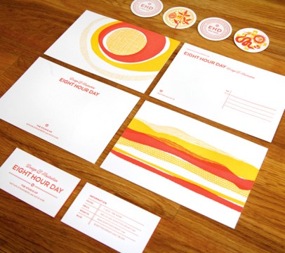
Eight Hour Day + Studio on Fire 

Two of my favourite studios coming together here.
Designed by EHD and printed by SOF – Words EHD.

“We created this identity with the understanding that we would be traveling for a year…Instead of a standard letterhead, we opted for a postcard and notecard. We felt this was more mobile and highlighted the idea that we were on the road. We also use a stamp to pinpoint our location on a map on the mailing label…Our new blog was a large part of this trip…we wanted to have something to give people we met along the way, or those people or places we wanted to feature that wasn’t as stuffy as a business card. Our solution was the blog pog – a bit quirkier leave behind that let people know we were going to blog about them (EHD Likes You) or simply directed people to the blog to find out more (EHD Was Here).”

Eight Hour Day + Studio on Fire both awesome + both in Minneapolis…!

Filed under: Design, Graphic, Printing techniques, , , , , ,

Studio On Fire – designed by Cathy Daly

I haven’t visited Studio On Fire’s site for a while – too much stunning print work on offer to even make an informed choice! Top of their blog seems a great place to start…

“These cards were letterpress printed in three colors on an appropriately sandy colored Mohawk Loop Antique Vellum Husk, custom pasted to a 220lb weight. Note how the island seal is printed in with just tonal transparent white ink. After the letterpress printing, these sheets were pasted back to back with digitally printed sheets (with the island beach image) for a 320lbC final weight. Those sheets were trimmed into oversize 4 x 2 inch business cards and edge colored in a matching blue.”

“This textural business card was designed by island director Cathy Daly for Musha Cay, David Copperfield’s lush 700 acre tropical retreat.”

Studio On Fire – words + work

Filed under: Design, Graphic, Printing techniques, , ,

Port magazine

Port magazine launching spring – “The new intelligent style magazine for men”

“Editor Dan Crowe and creative directors Kuchar Swara and Matt Willey have created a very modern magazine but one that is clearly positioned within their collective understanding of the history of magazines. This is no surprise – Crowe has form as editor of the creatively successful literary magazine Zembla; Willey designed that title while working at Frost Design; and Swara has worked at Esterson Associates and been part of Tyler Brulé’s Winkreative team, where he helped relaunch Italian interiors title Casa Da Abitare. This is a team with an interest in well-crafted editorial communication.

Seen first via magculture retweeted and blogged the world over I am quite sure.
(Words and images from magculture)

Filed under: Design, Graphic, , , , , , ,

Pages

Archives