The year I discovered Sagmeister

Icon

JAQK by Hatch – 1

Two reasons to love Hatch are: the quality of work (stunning) and their really exciting + ‘distinctive’ business model. Saw this work for JAQK on Graphic Exchange an age ago but today there is an update and some links to interviews with Hatch founders Joel Templin + Katie Jain with Iso50GrainEdit.

Hatch hail from San Francisco (founded 2007) – (selected) words from an interview with Iso50 back in 2009. Images featured on Iso50 + Graphic Exchange.

“Our original intention, the philosophy of the design firm, was to do this 80/20 split; where 80% of our time is focused on client work, building brands for other people — which we’ve always done and always will do — but then use 20% of the time to give our design team creative freedom to explore ideas for new products that we can hatch on our own. Take all of our creative exploration and put it into a product that we release once a year. Here we are, two an a half years later and JAQK is just growing, which is great, but it will be our only hatchling for a while.”

Their process:
“Internally we meet with the client and develop a creative brief together. We always have that creative brief, either they supply it with their marketing dept, we collaborate on it, or we interview them and we make it. It’s a document that states all the goals for the project and puts everything on paper. It takes the subjectivity out of the design, gets everyone on the same page.

From there we pull reference material. We used to collect old things, old books, scan stuff in, photocopy stuff etc. We used to spend hours at the photocopier. Now, with the web and everything else, everyone has folders full of stuff, so we start there. People pull reference material based on the internal creative brief and where we think it’s going to go. Everyone gets the opportunity to talk about why they pulled what they did, and then collectively we try and figure out ways to put it in silos — like all this stuff feels like an avenue we could go, this type, this color, here’s a illustrative thing we could do etc. Within those, there are still a gazillion things you could design, but at least it’s a little more focused. Then they go to town and start designing and we’ll do the same thing; everything gets pinned up and we talk about it, edit it.”

Online interviews: Part 1 + Part 2

Filed under: Design, Graphic, Illustration, Packaging, , , , , ,

johnson banks blog

Stumbled across this site when I was doing some research about branding – took me to a post from back in 07. Anyway always great to find new inspiration blogs out there esp from a pretty cool agency –

johnson banks Thought for the week blog here.

And for good measure here is a pic of their V&A map that is going to be included in Creative Review’s Annual – featured here on their blog. Have to say – love their work…

Filed under: Blogs, Design, Graphic, , ,

Type Shed 11 Map – The International Office

I just like the elegant format of this map…

“Our international guests, who included Stephen Banham, Donald Beekman, Walter Bohatsch, Paul Elliman, Experimental Jetset, Masayoshi Kodaira, Indra Kupferschmid, Christian Schwartz and Leonardo Sonnoli, were here, in Wellington, for five days – three of presentations and two of workshops – all under the one roof at Shed 11 and Site 7 – encircled by satellite events, forums and panels for discussion and debate, evening projections and entertainment. Typeface: Akkurat, Courier. Stock: Chromalux

The International Office again! Words and pics from their site…

Filed under: Design, Graphic, , , ,

French & German Film Festival 2010 – The International Office

In New Zealand, the Goethe-Institut, the Alliance Française, the German and the French Embassies have been active for many years fostering cultural cooperation and bringing films over here that otherwise would not have reached their Kiwi audience. Last year, the first German Film Festival in New Zealand commemorated the 20th anniversary of the fall of the Berlin Wall. The French Embassy has for four years in a row organised a similar festival in different cities around the country. Typeface: Haas Grotesk. Stock: Media Satin

From The International Office. Words and pics from their site.

Filed under: Design, Graphic, , , , , , ,

German Film Festival 2011 by The International Office

“Madman, adventurer and obsessive, Werner Herzog, with his eye for interesting people is one of the most significant personalities of New German Cinema. Typeface: Helvetica Neue. Stock: 100gsm Media Coated”

More work from The International Office coming out of New Zealand (2nd post of the night) one more to come. Words and pics from their site.

Filed under: Design, Graphic, , , , ,

This Crooked Way by The International Office

New Zealand’s moody, antipodean atmosphere evoked by clothing through monochromatic colour palettes and textural layering captured through beautiful photography from Meighan and David. Photography: Meighan Ellis & David James. Typefaces: Franklin Gothic, Brunel. Stock: 150gsm Photo-grade.

Seen via 1983
Designed by The International Office – not 100% sure of where they are based but I think this work looks awesome. Words + pics from The International Office.

Filed under: Design, Graphic, Photography, , , , , , ,

Pino – lifestyle store

“Pino is a market place for unique, functional and innovative design objects. The idea for the concept camefrom the name of the shop, Pino, which means a ‘pile’ or ‘stack’ in Finnish.That is taken visually into the new logo and the design of the shop fixtures.The interior concept with a subtle colour palette works as a background for thefresh, colourful identity and products.”

Words and images via Behance here.
Designed by Bond Creative Agency who hail from Helsinki.

(Photo credit Paavo Lehtonen)

Filed under: Design, Graphic, Interior, , , , , ,

Truth Branding by Socio

Branding lexicon in the next para – something I absolutely hate – but maybe this is the best way to communicate this stuff???

“Truth is a strategic insight consultancy offering global marketing solutions. They approached Socio to evolve their current branding and to create a fresh and coherent visual template for the brand. The identity needed to offer much more to accurately portray the dynamism and ground breaking approach of the company. The starting challenge was to use the existing logo and company colours but develop all other brand elements. The result was a new cohesive brand direction that was rolled out across internal and external marketing communications, acting as a visual voice for company. Clear guidelines were designed and printed to act as a staff handbook aiding a smooth transition to the new branding, including colour breakdowns, associated fonts as well as photographic style and illustration.”

Words and images taken from here (Behance).
Agency site Socio here.

Filed under: Design, Graphic, , , ,

Matjaz Cuk visual identity

Love the simplicity and thought behind this.

“A small design studio needs many different office materials for its communication. In order to cut down on costs, resources and waste, I had to rethink the design of stationery. Plans of 9 different items are printed on one sheet of paperboard using only two printing inks. A paper with excellent environmental credentials from Gmund has been used.

The required item can be cut out on demand. From one sheet of paper you can get:
– two small folders
– one large folder
– 7 CD packages, 5 medium sized cards and one bookmark
– two small notebook covers and 6 small cards
– two large notebook covers

Variable information such as my logo and address are printed on removable stickers. Printing waste is therefore minimal as materials can be used in various ways, reused and recycled at the end of their lifecycle.”

Matjaz Cuk Visual Identity – words and images taken from here.

Seen via Behance twitter feed.

Filed under: Design, Graphic, Printing techniques, , , , ,

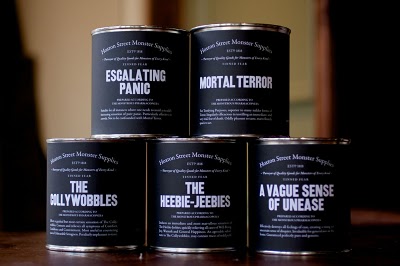
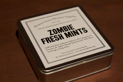
Ministry of Stories – We Made This

Fantastic story behind the fantastic project behind the fantastic concept.

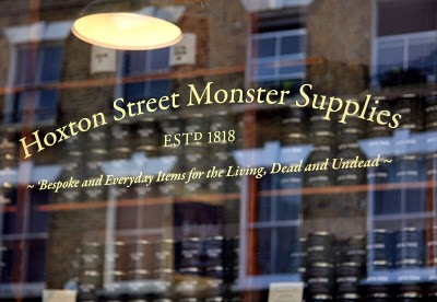
“The Ministry of Stories was founded by Nick Hornby and co-directors Lucy Macnab and Ben Payne. Hidden away at the back of The Monster Shop (where else would you expect it?), the Ministry of Stories provides a free space for fresh writing by young people. Here in Hoxton we provide workshops and one-to-one mentoring. The services are provided by volunteers: local writers, artists and teachers, all giving their time and talent for free.

The MoS is inspired by young people, and aims to inspire them to transform their lives through writing. We work closely with schools, supporting the work of teachers, but our great benefit is that we provide one-to-one mentoring for young people to enjoy imaginative stories, improve language skills, increase abilities in communication, add to social and educational confidence.”

(above words taken from) Ministry of Stories site.
Designed by We Made This (with more pics and explanation) here.

First seen via Graphic Exchange (although not there anymore) + What Makes Us

Filed under: Design, Graphic, Packaging, , , , , ,

Pages

Archives